Customize Flow for mobile
Last updated: June 17, 2026
Once you've integrated Flow for mobile, you can customize the colors, fonts, and borders of the various UI elements to match your application design.
To customize the properties:
- Create a
designTokensobject and include the color, font, or border keys you want to customize, along with their values. For example:
- Pass the
designTokenswhen you create the configuration instance:
You can customize the color of the following UI elements:
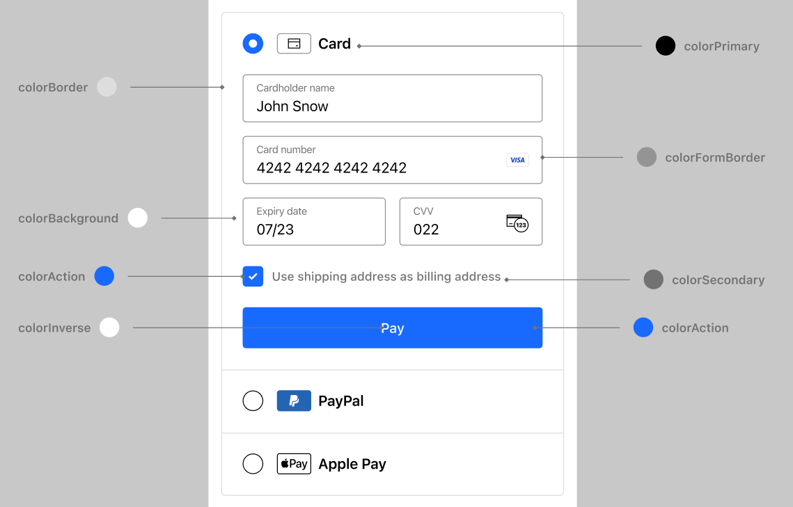
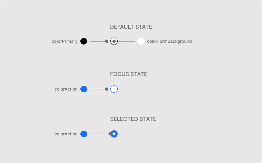
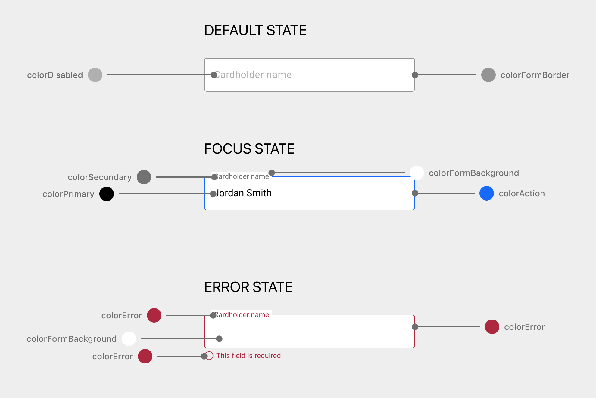
To customize an element, provide a color value to any of the following keys:
| Key | Format |
|---|---|
|
|
|
|
|
|
|
|
|
|
|
|
|
|
|
|
|
|
|
|
|
|
|
|
|
|
To make Flow for mobile use the same fonts as your web checkout page, use web fonts and set the font family names in the fontFamily key.
Use the following properties to modify the fonts for specific UI elements:
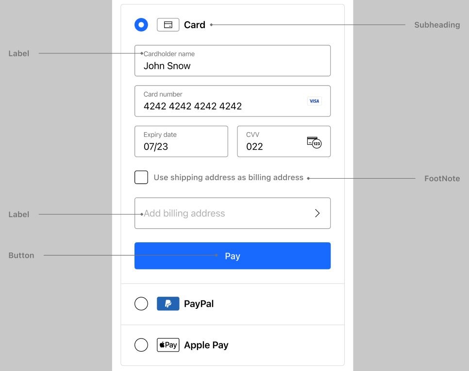
| Property | Type |
|---|---|
|
|
|
|
|
|
|
|
|
|
You can modify the following sub-properties of each font property:
| Property | Type | Example |
|---|---|---|
|
|
|
|
|
|
|
|
|
|
|
|
|
|
|
Information
To modify the text displayed in the UI, add a custom translation. For example, to change the text displayed within the payment button.
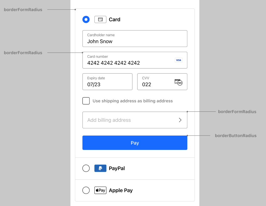
Use the following properties to modify the borders for specific UI elements:
| Property | Type | Default value |
|---|---|---|
|
|
|
|
|
|
You can customize options for the individual Flow components using component-specific configuration.
| Component key | Description |
|---|---|
| Specifies whether to display the pay button for this payment method. Mainly used for card payments. |
| Callback functions for handling events in the specific component. |
| The list of accepted card schemes for card payments. This can include one or more of the following:
|
| The list of accepted card types for card payments. This can include one or more of the following:
|
| The position of the cardholder name input field for card payments. This configuration takes the following values:
|
| The list of accepted card schemes for Google Pay payments, as mapped to the Google Pay API. This can be one or more of the following:
|
| The list of accepted card types for Google Pay payments, as mapped to the Google Pay API. This can be one or more of the following:
|
| The visual theme of the Google Pay button, as mapped to the Google Pay API. This can be one of the following:
|
| The label displayed on the Google Pay button, as mapped to the Google Pay API. This can be one of the following:
|
| The action to perform when the user selects the pay button. Mainly used for card payments.
|
| The list of accepted card schemes for card payments. This can be one or more of the following:
|
| The list of accepted card types for card payments. This can be one or more of the following:
|
| Pre-filled data for Remember Me. This configuration supports email address and phone number. |
| Indicates whether to display the pay button for Remember Me. |
| Configuration for managing the address collection and handling during the checkout process. Mainly used for card payments.
|