


Global digital payments
Unrivaled performance.
Payments move money; high-performance payments make money. Checkout.com delivers a global platform, transparent pricing, payments expertise and committed partnership – so you can thrive.
.svg)
.svg)


.svg)
.svg)
.svg)
.svg)
.svg)
.svg)


Where the world
checks out
High-performing businesses choose Checkout.com to boost acceptance rates, cut processing costs, fight fraud, and create extraordinary customer experiences.


New markets reached overnight for payouts
.webp)
.svg)
Improvement in acceptance rate*
* Across UK, Norway, Spain, and Denmark
.webp)
.svg)
Increase in acceptance rate from local processing
.webp)
.svg)
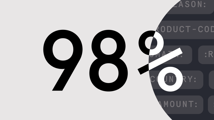
Virtual cards issued with 99% acceptance rate
One API. Countless opportunities.
Payment Processing
Process payments everywhere, in real-time. Our local expertise and global payment platform help you capture more value from every transaction.
Get debit and credit card processing – wherever you do business. Access local payment methods through our global payments platform.
Manage recurring payments with a secure and easy-to-use subscription payment processor, designed to keep your revenue flowing.
Give customers in every market a smooth-flowing mobile payment experience. We support mobile payments through all major credit and debit cards.
Payouts
Send seamless payouts with smart infrastructure designed to elevate the customer experience, improve performance, and unlock global coverage at pace.
Identity Verification
Accurately identify users and combat fraud with a fast verification experience built to convert. Identity Verification helps you win more customers at pace.
Fraud Detection
Adaptable. Intelligent. Highly customizable. Our fraud engine responds to your needs, helping you strike a balance between protection and approval rates.
Intelligent Acceptance
Maximize acceptance rates. Minimize routing costs. Intelligent Acceptance harnesses AI, our global data network, and deep expertise to grow your revenue.
Authentication
Fight fraud. Stay compliant. Our flexible 3D Secure authentication works across all your acquirers, including the Checkout.com platform.
Issuing
Launch and manage your own card program. Our one-stop issuing shop enables you to create custom cards, earn a share of interchange revenue and removes complexity.
Where the world
checks out
See how Checkout.com powers performance for global businesses.
Popular resources


Latest articles

.jpg)
.jpg)
Developer resources
Frequently asked questions

Checkout.com enables businesses to move, manage, and optimize money by acting as an end-to-end Payment Services Provider. We empower businesses to accept payments online and disburse funds to their entities and customers through a range of payment methods and integration options.
To help merchants accept the highest possible number of legitimate payments while preventing fraud, we offer Intelligent Acceptance, Authentication, Identity Verification, and Fraud Detection tools. With these tools, businesses can find the point between risk and acceptance that’s right for them.
We also help our merchants direct funds flexibly, giving them a view of their balances across payins and payouts across all geographies and currencies, allowing them to manage these payments through a single dashboard.
We offer a range of integration options, including hosted payment pages – a simple integration method that allows businesses to provide us with payment information, which we use to generate a link that redirects customers to a hosted payments page.
All of our integration methods are supported by detailed technical documentation, an API reference, and FAQs, with a dedicated support team to help with merchants' questions.
Checkout.com’s platform is built using proprietary technology and is highly resilient. Our platform has self-healing capabilities which improve scalability and optimization, allowing our platform to deliver uptime.
As a cloud-native platform, we take full advantage of utilizing availability zones. This significantly reduces redundancy and improves fault tolerance. In other words, if a failure occurs - be it due to hardware issues, software glitches, network outages, cyberattacks, or even natural disasters - our platform is designed to automatically reroute to a different, functional availability zone.
Our innovative use of technology makes our platform a dependable partner in your business journey.
Checkout.com is a global payment service provider with local acquiring capabilities in over 50 countries across Europe, North America, the Middle East and Asia-Pacific.
Our platform supports more than 150 processing currencies, enabling businesses to avoid cross-border charges and reduce foreign exchange costs.
We also provide extensive local support through our 19 offices worldwide. Our experts can help you to grow or streamline your payments globally – wherever you are, whenever you need us.
We support all the major card schemes and a range of popular ways for consumers to pay in local markets - including direct debit payment methods, voucher payment schemes, digital wallets, and bank transfers. For more information on the different payment methods we support in different regions see our payment methods directory.